

Table of Contents
Hero
All full width hero images should be prepped at 1920px ×1000px which is slightly larger than its container to accomodate for parralax if needed.
Hero - Left Aligned (default)
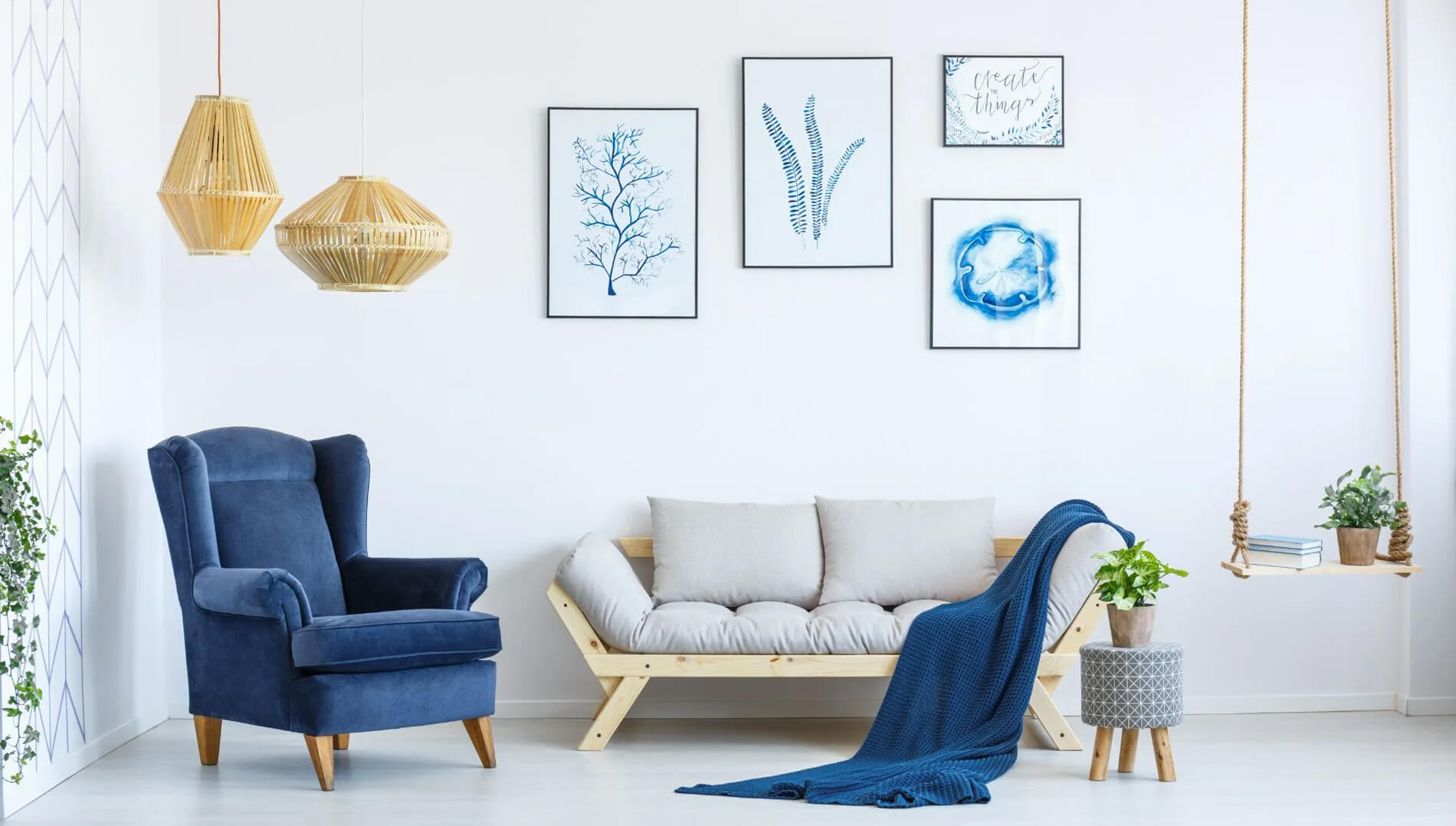
Hang with Us
Image Size(s)
| Scene7 Preset Name: | nhw-hero |
|---|---|
| Image Size: | 1920px × 1000px |
Hero - Center Aligned
Hang with Us
Image Size(s)
| Scene7 Preset Name: | nhw-hero |
|---|---|
| Image Size: | 1920px × 1000px |
Hero - Right Aligned
Hang with Us
Image Size(s)
| Scene7 Preset Name: | nhw-hero |
|---|---|
| Image Size: | 1920px × 1000px |
Hero - w/ Parallax
Hang with Us
Image Size(s)
| Scene7 Preset Name: | nhw-hero |
|---|---|
| Image Size: | 1920px × 1000px |
Hero - Short
Hang with Us
Image Size(s)
| Scene7 Preset Name: | nhw-hero |
|---|---|
| Image Size: | 1920px × 1000px |
Hero - Video
Easy Flat Strap Installation
Image Size(s)
| Video Size: | 1920px × 1080px |
|---|
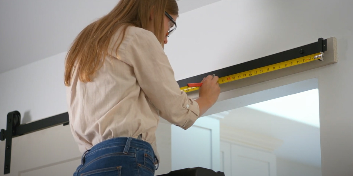
Hero - w/ Feature Icon & Footnote
Right, Tight, Sturdy or Square
Image Size(s)
| Scene7 Preset Name: | nhw-hero |
|---|---|
| Image Size: | 1920px × 1000px |
Hero - Inverted Text
Hang with Us
Image Size(s)
| Scene7 Preset Name: | nhw-hero |
|---|---|
| Image Size: | 1920px × 1000px |
Hero Featured Project
All full width hero images should be prepped at 1920px ×1000px which is slightly larger than its container to accomodate for parralax if needed.

Easy Springtime Box Planters
-
Difficulty:Moderate
-
Team:1-2 People
-
Time:1h 30min
Image Size(s)
| Scene7 Preset Name: | nhw-hero |
|---|---|
| Image Size: | 1920px × 1000px |
Hero Rotator

Hang with Us

Some other title
Hang with Us
Image Size(s)
| Scene7 Preset Name: | nhw-hero |
|---|---|
| Image Size: | 1920px × 1000px |
Centered Carousel
A carousel with peeking of previous and next slides.
Tip: All images in the slider should be prepped at a similar height and width for consistency. At least a 900px width is recommended
Image Size(s)
| Scene7 Preset Name: | nhw-centered-carousel-images |
|---|---|
| Image Size: | 900px width (variable height) |
Featured Product Slider
Featured product callout with product image slider


Image Size(s)
| Scene7 Preset Name: | nhwFeatureProjectSlideImage |
|---|---|
| Image Size: | 800px width (variable height) |
Rotator
A feature rotator.
Image Size(s)
| Scene7 Preset Name: | nhwRotatorThumb |
|---|---|
| Image Size: | 110px × 110px |
Category Step Slides
A slider used to step through instructional processes.
Image Size(s)
| Scene7 Preset Name: | nhwCategoryStepSlideImage |
|---|---|
| Image Size: | 750px width (variable height) |
Category Navigation
Feature blocks to navigate through product categories.
All javascript for this module is located in /src/js/NHW/modules/categoryNavigation.js
This module lets you specify a limit in the CMS at which point the "Show All Categories" button will show and hide the remainder of the product categories. Clicking the "Show All Categories" button will reveal the remaining categories.
Note: There is conditional .cshtml markup associated with this module that may not work on the styleguide. More so for display only.
Image Size(s)
| Scene7 Preset Name: | category |
|---|---|
| Image Size: | 268px × 230px |
Project Query Results Slider
This module will dynamically pull in projects and visibly display from 1 to 3 slides in the slider. Any number of projects can be selected. After 3 projects it will turn into a carousel and you will be able cycle through the remaining projects. Projects can be selected by "Cherry-Picking" individual projects to show or by criteria.
The module is just the projects and titles. Any text to the left or right of the projects will need to be created using a layout widget: 4col - 8col for example. You can drop a Content Block in the 4 column region for example and place the Project Query Results Module in the 8 column region.
Available Criteria options are as Follows:
- Project Categories
- Project Type
- Ambassador
- Product Categories
- Manual Selection (Cherry Pick)
These ready made projects will revamp your space in a single weekend.
Url parameters are added onto the end of the incoming hero image to adjust size here. With 1 project selected the image will be 900px. With 2 projects selected the image will be 600px. With 3 images or more the image will be 400px.
Image Size(s)
| Scene7 Preset Name: | No Preset - Project Hero Image is pulled in automatically and resized with Scene7 url param |
|---|---|
| Image Size: | 900px width |
Product Query Results
This module will dynamically pull in selected products from a set of criteria.
Products cards are a Vue.js component (src/js/NHW/components/Shared) and are driven by JSON data. The below markup
Best Sellers


Url parameters are added onto the end of the incoming hero image to adjust size here. With 1 project selected the image will be 900px. With 2 projects selected the image will be 600px. With 3 images or more the image will be 400px.
Image Size(s)
| Scene7 Preset Name: | s7product |
|---|---|
| Image Size: | 400px × 400px |
| Scene 7 Preset Name: | nhwSwatchThumb |
| Image Size: | 38px × 38px |
Scene7 Image
Module allows you to place a scene7 image into a layout widget.
The image is often paired with the bootstrap class .w-100 which sets its width to 100%. It can also use the class .img-fluid which sets a max-width of 100%.
To control the various image options append query string params onto the image identifier such as picture-of-hinge?wid=600&fit=constrain&qlt=90&fmt=png-alpha or if you know the scene7 preset size of the image you want to add you can add that like so picture-of-hinge?$nhwContentAndMedia$. Preset name should be surrounded by dollar signs.

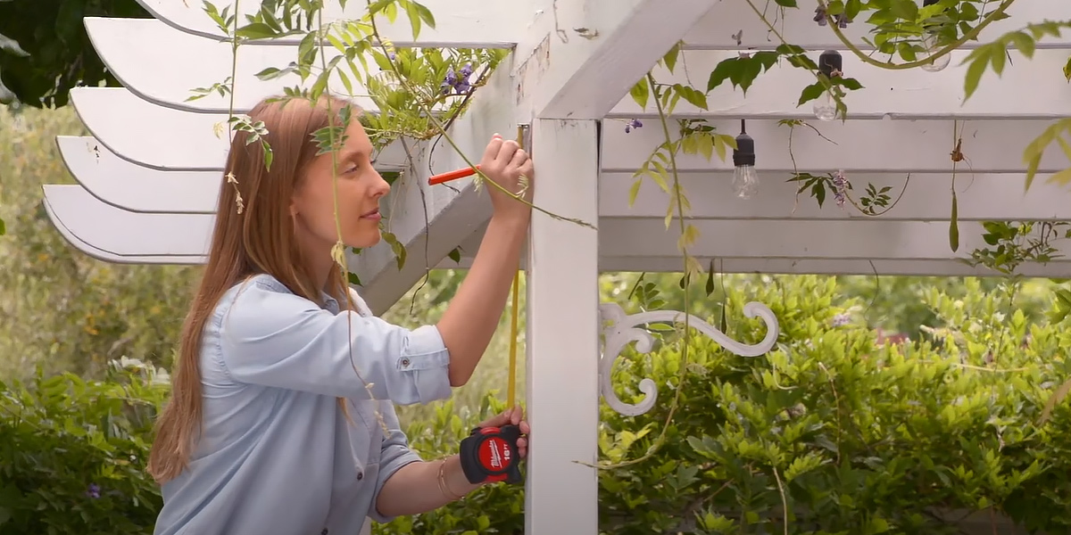
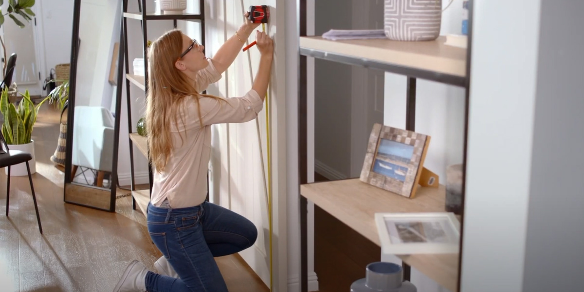
Content and Media
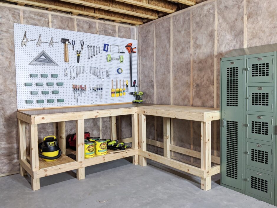
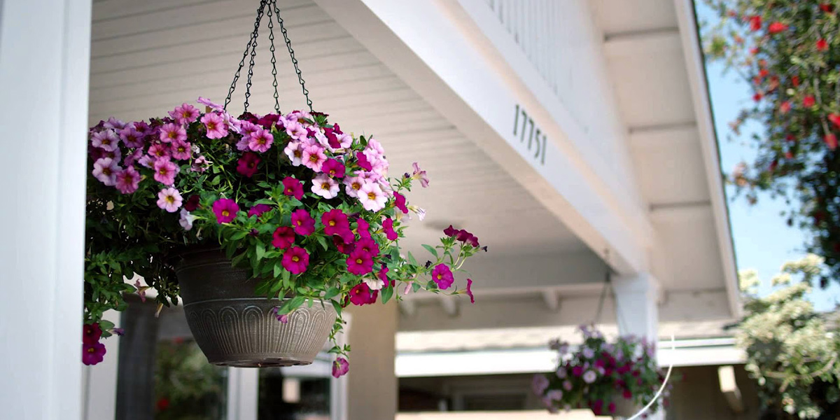
The content and image module is an easy way to display a block of textual content and CTAs and an image, video, or custom HTML content side-by-side.
Media Right (Default)

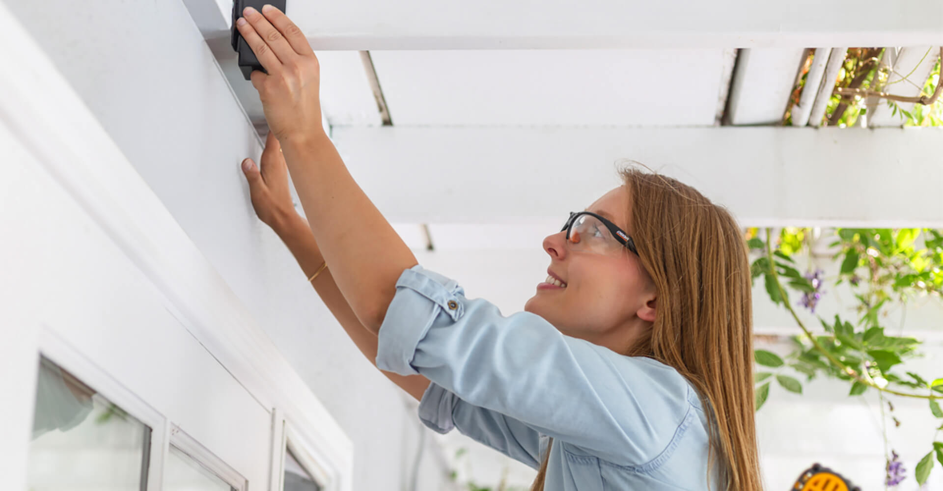
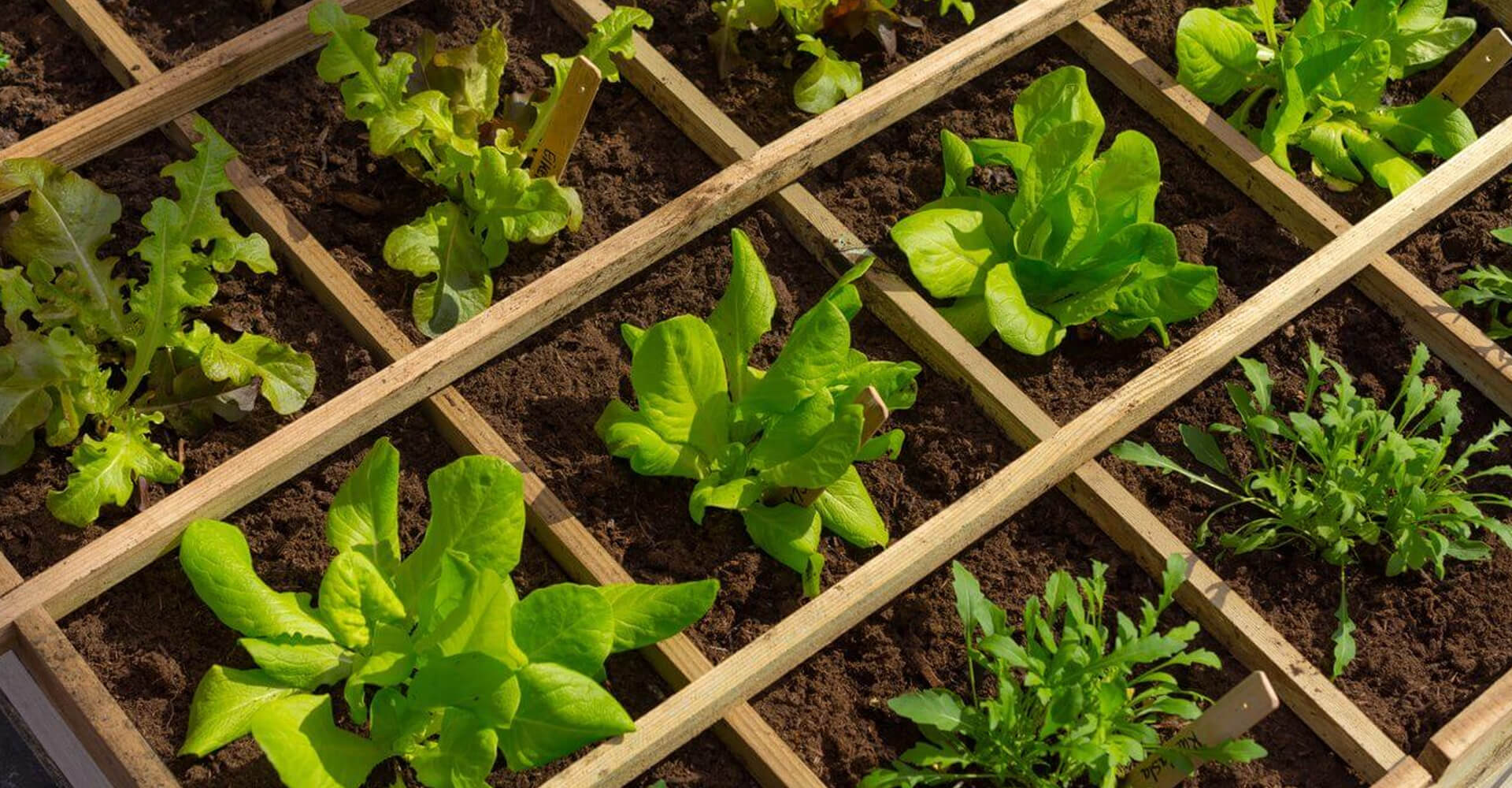
Plant your Garden
Remove your plants from their pots and begin placing them inside the raised bed. Make sure you're leaving enough space for their roots to spread. Finally, fill in around the plants with top soil. Then stand tall and admire a job well done.
Media Left
Plant your Garden
Remove your plants from their pots and begin placing them inside the raised bed. Make sure you're leaving enough space for their roots to spread. Finally, fill in around the plants with top soil. Then stand tall and admire a job well done.
Media left Video Example
Media Right Video Example
Full Width Content and Media Example

Sample Heading Here
Sample Heading Here
Image Size(s)
| Scene7 Preset Name: | nhwContentAndMedia |
|---|---|
| Default Image Size: | 600px width (Variable Height) |
| Scene 7 Preset Name: | nhwContentAndMediaLarge |
| Full Width Image Size | 1000px width (Variable Height) |
Content and Media Slider

Image Size(s)
| Scene7 Preset Name: | nhwCmsSliderImage |
|---|---|
| Image Size: | 500px Height (Variable Width) |
Video
The video module is used to display a link to a video in YouTube.
Video in Container
Video with Title Overlay
Video in Grid


Full-Width Video
Image Size(s)
| Scene7 Preset Name: | nhwVideoPoster |
|---|---|
| Image Size: | 1200px × 600px |
Zoomable Images
In order for the modal to pull in the correct ids a class of '.js-grouping' needs to be on the parent item. The styleguide is using the same javascript as the dev site therefore the modal popup will no work due to path differences


Image Size(s)
| Scene7 Preset Name: | nhwZoomableImage |
|---|---|
| Image Size: | 550px × 550px |
Accordion List
Accordion Module
Default
-
Does this device lock?
This is a test of q1 content
-
Does it come with the hardware needed for install?
This is a test of q2 content
-
Vivamus magna leo, rhoncus sit amet turpis sit amet, tempor lacreet mi?
This is a test of q3 content
<ul class="accordion-list">
						<li class="accordion-list__item">
							<a href="#" class="accordion-list__link js-acc-trigger">
								Does this device lock?
							</a>
							<div class="accordion-list__content">
								<div class="accordion-list__content-inner">
									This is a test of q1 content
								</div>
							</div>
						</li>
						<li class="accordion-list__item">
							<a href="#" class="accordion-list__link js-acc-trigger">
								Does it come with the hardware needed for install?
							</a>
							<div class="accordion-list__content">
								<div class="accordion-list__content-inner">
									This is a test of q2 content
								</div>
							</div>
						</li>
						<li class="accordion-list__item">
							<a href="#" class="accordion-list__link js-acc-trigger">
								Vivamus magna leo, rhoncus sit amet turpis sit amet, tempor lacreet mi?
							</a>
							<div class="accordion-list__content">
								<div class="accordion-list__content-inner">
									This is a test of q3 content
								</div>
							</div>
						</li>
					</ul>
Accordion Module - FAQs
Accordion FAQs are the same as the standard accordion with the exception of a modifier class .accordion-list--faqs
This modifier class adds the appropriate "Q" and "A" pseudo elements to the question and answer so they dont need to be added manually
FAQs
-
How do I know when the filters need to be replaced?
This is a test of q1 content
-
Vivamus magna leo, rhoncus sit amet turpis sit amet, tempor lacreet mi?
This is a test of q2 content
-
Vivamus magna leo, rhoncus sit amet turpis sit amet, tempor lacreet mi?
This is a test of q3 content
<ul class="accordion-list accordion-list--faqs">
						<li class="accordion-list__item">
							<a href="#" class="accordion-list__link js-acc-trigger">
								How do I know when the filters need to be replaced?
							</a>
							<div class="accordion-list__content">
								<div class="accordion-list__content-inner">
									This is a test of q1 content
								</div>
							</div>
						</li>
						<li class="accordion-list__item">
							<a href="#" class="accordion-list__link js-acc-trigger">
								Vivamus magna leo, rhoncus sit amet turpis sit amet, tempor lacreet mi?
							</a>
							<div class="accordion-list__content">
								<div class="accordion-list__content-inner">
									This is a test of q2 content
								</div>
							</div>
						</li>
						<li class="accordion-list__item">
							<a href="#" class="accordion-list__link js-acc-trigger">
								Vivamus magna leo, rhoncus sit amet turpis sit amet, tempor lacreet mi?
							</a>
							<div class="accordion-list__content">
								<div class="accordion-list__content-inner">
									This is a test of q3 content
								</div>
							</div>
						</li>
					</ul>
Stack
The Stack module consists of an image, title, a description, and an optional call-to-action (CTA). Stacks can be displayed in 2, 3, and 4 column rows.
The stack module has the following variants for adjusting to your design. These can be specified by clicking on "Edit" once your stack is dragged onto a given page
- Alignment - Stack options include Left, Center, or Right Aligned.
- Height - Stack options include Short, Default, Tall or Tallest.
- Columns - Stack options include 2, 3, and 4 columns.
Stack List - Alignment Variations
Left Aligned
-
Starter Kit
Builder
Sample description for testing the stack module go here in the description content placeholder -
Starter Kit
Builder
Sample description for testing the stack module go here in the description content placeholder -
Starter Kit
Builder
Sample description for testing the stack module go here in the description content placeholder

Center Aligned
-
Starter Kit
Builder
Sample description for testing the stack module go here in the description content placeholder -
Starter Kit
Builder
Sample description for testing the stack module go here in the description content placeholder -
Starter Kit
Builder
Sample description for testing the stack module go here in the description content placeholder
Right Aligned
-
Starter Kit
Builder
Sample description for testing the stack module go here in the description content placeholder -
Starter Kit
Builder
Sample description for testing the stack module go here in the description content placeholder -
Starter Kit
Builder
Sample description for testing the stack module go here in the description content placeholder
Stack List - Height Variations
Short
-
Starter Kit
Builder
Sample description for testing the stack module go here in the description content placeholder -
Starter Kit
Builder
Sample description for testing the stack module go here in the description content placeholder -
Starter Kit
Builder
Sample description for testing the stack module go here in the description content placeholder

Default
-
Starter Kit
Builder
Sample description for testing the stack module go here in the description content placeholder -
Starter Kit
Builder
Sample description for testing the stack module go here in the description content placeholder -
Starter Kit
Builder
Sample description for testing the stack module go here in the description content placeholder
Tall
-
Starter Kit
Builder
Sample description for testing the stack module go here in the description content placeholder -
Starter Kit
Builder
Sample description for testing the stack module go here in the description content placeholder -
Starter Kit
Builder
Sample description for testing the stack module go here in the description content placeholder

Tallest
-
Starter Kit
Builder
Sample description for testing the stack module go here in the description content placeholder -
Starter Kit
Builder
Sample description for testing the stack module go here in the description content placeholder -
Starter Kit
Builder
Sample description for testing the stack module go here in the description content placeholder
Stack List - Column Variations
2 Column
-
Starter Kit
Builder
Sample description for testing the stack module go here in the description content placeholder -
Starter Kit
Builder
Sample description for testing the stack module go here in the description content placeholder
3 Column
-
Starter Kit
Builder
Sample description for testing the stack module go here in the description content placeholder -
Starter Kit
Builder
Sample description for testing the stack module go here in the description content placeholder -
Starter Kit
Builder
Sample description for testing the stack module go here in the description content placeholder
4 Column
-
Starter Kit
Builder
Sample description for testing the stack module go here in the description content placeholder -
Starter Kit
Builder
Sample description for testing the stack module go here in the description content placeholder -
Starter Kit
Builder
Sample description for testing the stack module go here in the description content placeholder -
Starter Kit
Builder
Sample description for testing the stack module go here in the description content placeholder
Button or Link Variation
Link Style
-
Starter Kit
Builder
Sample description for testing the stack module go here in the description content placeholder -
Starter Kit
Builder
Sample description for testing the stack module go here in the description content placeholder -
Starter Kit
Builder
Sample description for testing the stack module go here in the description content placeholder
Button Style
-
Starter Kit
Builder
Sample description for testing the stack module go here in the description content placeholder -
Starter Kit
Builder
Sample description for testing the stack module go here in the description content placeholder -
Starter Kit
Builder
Sample description for testing the stack module go here in the description content placeholder
Image Cover or Image Contain
Image Cover
-
Starter Kit
Builder
Sample description for testing the stack module go here in the description content placeholder -
Starter Kit
Builder
Sample description for testing the stack module go here in the description content placeholder -
Starter Kit
Builder
Sample description for testing the stack module go here in the description content placeholder
Image Contain
-
Starter Kit
Builder
Sample description for testing the stack module go here in the description content placeholder -
Starter Kit
Builder
Sample description for testing the stack module go here in the description content placeholder -
Starter Kit
Builder
Sample description for testing the stack module go here in the description content placeholder
Stack List Reversed
Barn Door Handles
-
Starter Kit
Builder
Sample description for testing the stack module go here in the description content placeholder -
Starter Kit
Builder
Sample description for testing the stack module go here in the description content placeholder -
Starter Kit
Builder
Sample description for testing the stack module go here in the description content placeholder
Image Size(s)
| Scene7 Preset Name: | nhw-stack |
|---|---|
| Default Image Size: | 720px × 500px |
| Scene7 Preset Name: | nhwStackShort |
| Short Image Size: | 180px height (Variable Width) |
| Scene7 Preset Name: | nhwStackTall |
| Tall Image Size: | 600px height (Variable Width) |
| Scene7 Preset Name: | nhwStackTall |
| Tallest Image Size: | 600px height (Variable Width) |
Grid Content
Used to display up to 5 image links or videos in a custom grid
The number of items is counted and a class is applied dynamically to change layout
Classes that control the layout are as follows: .grid-content--1-items, .grid-content--2-items, .grid-content--3-items, .grid-content--4-items, .grid-content--5-items
How To's
Finding the right bar door might be easier than you think.
How To's
Finding the right bar door might be easier than you think.

How To's
Finding the right bar door might be easier than you think.
How To's
Finding the right bar door might be easier than you think.
How To's
Finding the right bar door might be easier than you think.
Image Size(s)
| Scene7 Preset Name: | nhwGridContentItem |
|---|---|
| Default Image Size: | 800px width (Variable Height) |
Literature
Literature Card

Literature Grid
Image Size(s)
| Scene7 Preset Name: | nhwLiteratureImage |
|---|---|
| Image Size: | 150px × 150px |
Intro Content Blocks
Intro content blocks are used as introductions to a section.
